UPERFECT pushes brand reset with IFA reveal
2026-08-11
Brand overhauls rarely stay cosmetic; this one clearly does not. A new UPERFECT logo, packaging system, and global website arrive as a single coordinated reset, signaling that the company wants its portable display catalog treated as a unified ecosystem rather than a loose stack of SKUs. The visual refresh tightens recognition across regions, while the rebuilt site architecture leans into product families, use cases, and clearer navigation for both retail buyers and system integrators.
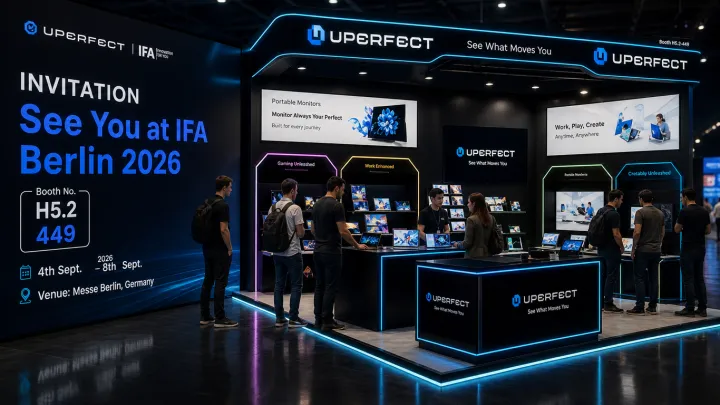
Trade show floors still decide which brands feel serious, and UPERFECT is betting heavily on that stage in Berlin. At its stand in Messe Berlin, the company plans to line up an expanded range of portable display solutions that move beyond basic secondary screens toward more specialized roles, from on-the-go creative workstations to console and mobile gaming setups. By anchoring the brand upgrade to a physical showcase, UPERFECT links its new identity directly to tangible hardware breadth and signals that its portable display ecosystem is meant to scale across both consumer and professional workflows.
Loading...

